
Designing AI research product that secured six figures seed funding in 8 weeks
Overview
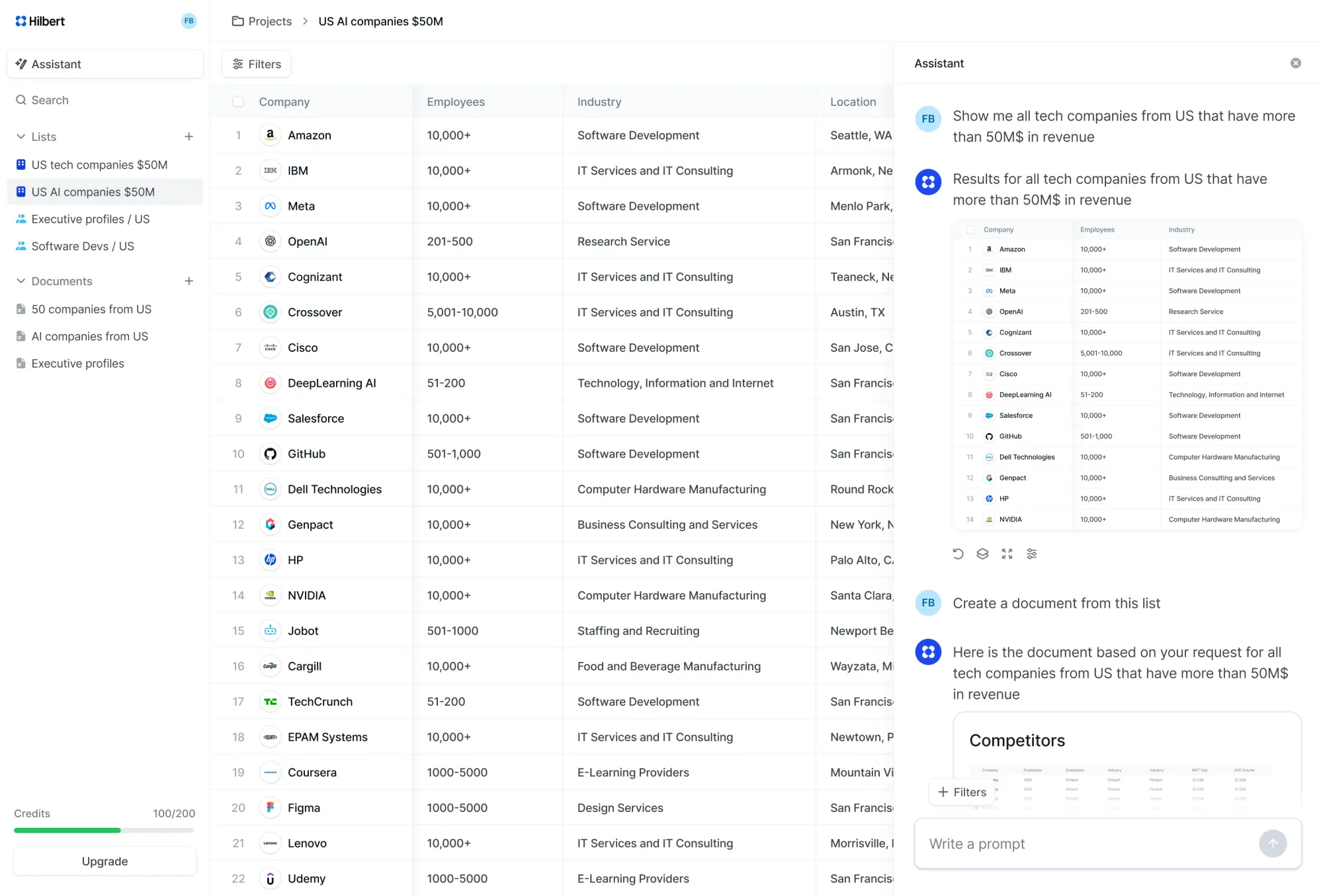
Hilbert AI aimed to help researchers, investors, and analysts find and evaluate companies more effectively.
As an early stage startup, the goal was to create an AI powered research tool that could surface relevant companies, organise complex information clearly, and help users discover patterns and opportunities.
My role
As the founding designer, I worked directly with the founder to shape the product from its earliest concept. With no existing product structure in place, I defined the information architecture, designed search and research interactions, and explored multiple approaches to presenting AI-generated data. I prototyped rapidly, tested ideas in short cycles, and iterated based on feedback.
Key deliverables and impact
Secured ~€500K in funding
Shipped product from concept to seed funding in 8 weeks
120+ design iterations in 60 days
Designed the core workflow, navigation model, and interaction patterns
End to end design leadership
Transformed an abstract AI vision into a coherent product strategy and architecture
The problem
Researchers spend hours switching tools instead of researching
Researchers had to jump between databases to find companies and people, manually export data to spreadsheets, then switch to separate tools to write reports and documents.
Each tool used different formats and required constant context switching. Research became more about managing tools than generating insights.
Objectives
Business
- Secure €500K in seed funding by demonstrating clear product vision and execution capability
- Validate market demand with early adopters confirm researchers prefer conversational approach over traditional tools
- Prove AI can reliably handle complex research tasks at scale
Product
- Establish architecture supporting long term product evolution
- Lower barrier to entry for non technical researchers
- Enable user understanding and control of AI-generated content
Approach
Breaking down the brief
The functional spec defined what the product needed to do, but not how these pieces would fit together.
I used this as an opportunity to ask foundational questions:
What's the primary user workflow? Which features need persistent access versus contextual activation? Where will cognitive load accumulate?
By reframing requirements as design constraints, I identified the structural decisions that would shape the entire product: hierarchy, navigation patterns, and feature boundaries.

Defining information architecture
The functional spec gave me the what and now I needed to define the how.
I translated the requirements into a product architecture by making structural decisions: Should lists live inside projects or exist independently? Should agents be project scoped or global? How does generated content flow into the editor? Where do configuration and settings sit in the hierarchy?
These architectural choices created the framework that guided every interface decision afterward.

The core question
How to create a fluid workflow between AI conversation and project navigation?
This was the central question before a single screen was designed.
So we didn't start with the answer. We explored a bunch of concepts and our process was a series of experiments to find the right balance between immediate clarity and long term scalability.
If you want to see an exploration chaos you can click here, but now here are some of them.
Option 1Dedicated panels. Clear separation, but felt rigid and fragmented
Option 2Dedicated panels. Clear separation, but felt rigid and fragmented
What user testing showed
Based on initial focus group feedback, the persistent sidebar emerged as the working solution.
What it solved
Quick project access AI chat and work remained central Document organisation within projects
Testing revealed new needs
As we continued testing, users wanted to create more projects, invite team members, and manage growing document libraries. The persistent sidebar accommodated these needs and became the foundation for further development.
Option 3The persistent sidebar emerged as the working solution.
Final decision on the architecture
The final architecture was a strategic decision on scalability and driven by future proofing
Anticipating and planning new features, I prioritised a flexible architecture over a fixed layout.
It was less about choosing the 'best' navigation pattern and more about building in flexibility from the start. I was designing a foundation that could hold future features without needing a complete overhaul.
Animation of the final result
Continuing to scale the workflow
How to offer the right balance of freedom and guidance from the very start?
Speed for efficiency. The Template Library
To eliminate blank canvas anxiety and accelerate time to value, we provided a curated library of pre built templates. Users could instantly start with a proven structure, making the tool useful from their very first session without any setup.

Screen that shows templates and what's inside
Creating your own template. Visualising progress
At each stage, users could generate a live preview to validate their input. This step by step confirmation first for documents, then for lists transformed setup into a series of confident decisions, ensuring the final template matched their expectations before creation.
Animations that shows auto generation on the right
The AI should follow, not lead
Our initial setup used structured forms users filled fields for company names, industries, criteria. Functional, but constraining. Users adapted to our structure rather than expressing their intent naturally.
This broke a core principle:
Users should lead their creation, not follow our forms.
I redesigned the setup flow to be conversational. Instead of filling forms, users describe research goals in natural language.
Designing conversational input
The interaction shifts from form filling to dialogue. Users describe their research goal in plain language. The system responds contextually, suggesting relevant filters, asking for clarification only when necessary.
Animations that shows user's input request and AI response
This shift moved control from system to user. The AI became a helpful collaborator rather than a structured questionnaire. Users could express complex research needs in one sentence instead of navigating through multiple form fields.
Results and impact
Over two months of intensive collaboration with the founder, I designed the product from zero to fundable:
Key deliverables and impact
Strategic foundation
Established the information architecture and interaction patterns that could scale from MVP to multi-feature platform, making early architectural decisions that avoided technical debt as capabilities expanded.
User validation
Early adopters responded positively to the conversational research workflow, confirming that the AI-assisted approach reduced friction compared to traditional research tools.
Business outcome
The product secured €500K in funding, with the design work serving as a critical proof-of-concept that demonstrated both product vision and execution quality to investors.
My learnings
I've learned that
Early architecture compounds
Early stage pressure favours speed over structure, but this project reinforced the opposite: architectural decisions made in the first weeks. It compound over time. Investing in structure early prevented costly redesigns as the product grew.
User satisfaction ≠ optimal design
Users responded positively to the conversational workflow, yet their behavior revealed friction they'd normalised. Satisfaction doesn't equal optimal. Observe behavior, not just sentiment
Collaboration speed is a design skill
Two months from spec to funding required more than design skill. It required deliberate collaboration infrastructure. Structured feedback with the founder, rapid review cycles with the developer, and early flagging of blockers kept us aligned and fast.